November 2016 Update
Thank you for the positive feedback from last month’s update. We received several questions about the design process, so Industrial Design is the focus of our November update.

The Evolution of Shaper Origin
My name is Matty, and I lead Design at Shaper. I joined in late 2014 when it became clear that the company was moving from testing proof-of-concept prototypes to launching a consumer-facing product. At that time, the company was called Taktia and the company’s aesthetic might best be described as utilitarian.

Early Prototype “A”
Design Principles at Shaper
When we kicked off the design process, we first worked to identify adjectives we would want to use to describe Origin. We spent time considering how we wanted customers to feel while interacting with Origin. We thought a lot about other products that evoke a similar feeling. For example: if Shaper Origin was a car, which make and model would it be? Below are some products from which we drew inspiration while developing our principles. After much deliberation, we landed on the following three descriptors:
Friendly Our tool should invite its users to engage with it. Simple Our tool should be intuitive, both physically and digitally. Capable Our tool should feel efficient, effective, and long lasting.
These have served and continue to serve as powerful guidelines. Each time we face a design decision, we ask ourselves: “Does this align with our design principles?”

Design Inspiration
From “A” to “B”
With early prototypes, we learned a lot about how the tool needed to function. But we also learned we would need to address some immediate issues before testing with a wider audience outside of a lab setting, including dust collection and cable management. Armed with our guiding principles, we began producing sketches and reviewing concepts.

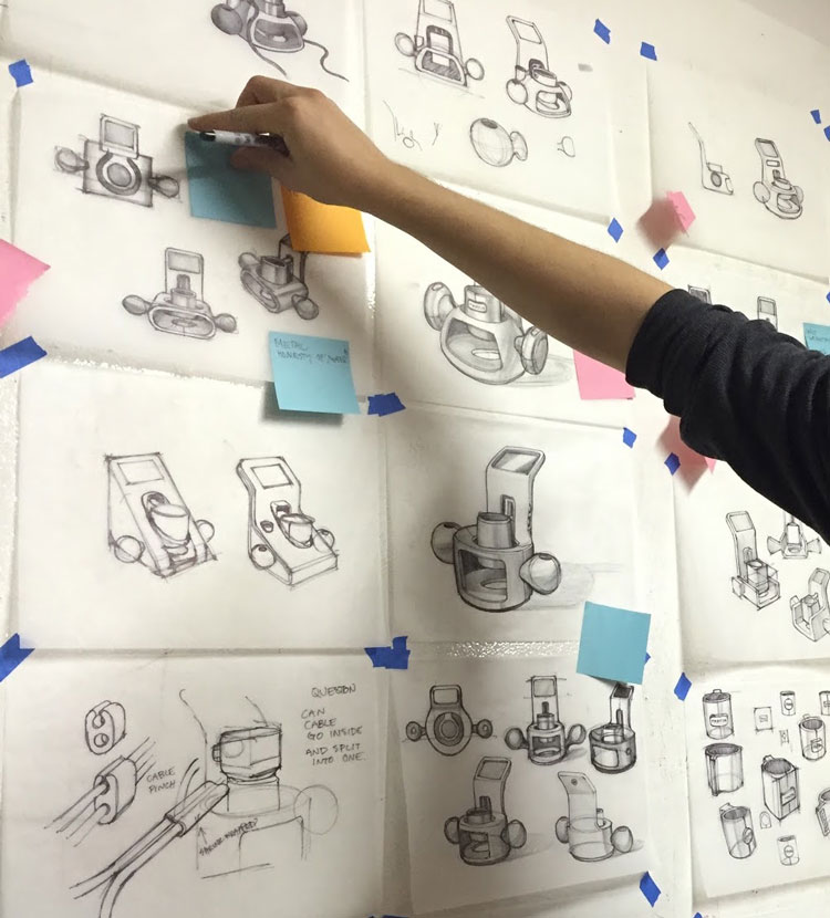
Early “B” Sketches
During design reviews we tagged with post-it notes the things we liked about each concept. This was a good approach when refining concepts because it allowed people from different backgrounds and perspectives to be involved. After multiple rounds of sketch reviews a few general directions emerged.

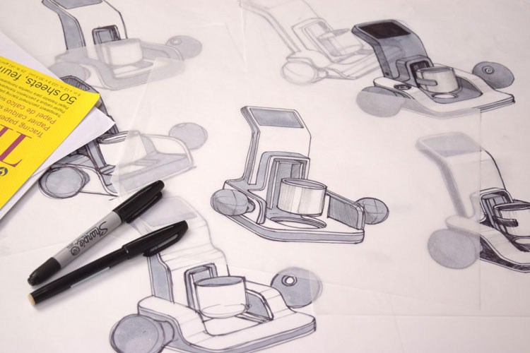
Later “B” Sketches
We started bringing these concepts into 3D CAD, allowing us to easily place the components within a design envelope and get a better understanding of scale and viability. We also started thinking seriously about manufacturability of Origin.

Early “B” Concept Renderings
In the image above, note that the logo on the screen that appears to be two tetris pieces. This design and logo existed when the company name was Taktia. Soon after, we re-branded to Shaper to better reflect our core principles.
Concept Refinement
At this stage we had refined our concept down to a point where it fit all our components and was in line with our three design principles. The large ergonomic handles and the clean lines combined with the large soft radii provided a friendly approachable feeling. The simplicity can be seen in the restrained use of color, only using it as a marker for the major touch points. The use of rigid durable materials and overall utilitarian styling made our product capable.

Rendering of “B”
Working Units
Satisfied with concept development, we fabricated twelve “B” prototype units for real-world beta testing to evaluate the overall experience, assess improvements, and understand the manufacturing constraints of the new design. We consider these prototypes our development workhorses, and continue to utilize them as we further develop Origin. They are featured prominently in many of our videos.

Functional “B” Prototypes
From “B” to “C”
In developing “C” (Origin’s final design) we wanted to keep the overall gesture and architecture as close as possible to its predecessor while focusing on areas of improvement based on learnings from “B”.

Early “C” Sketches
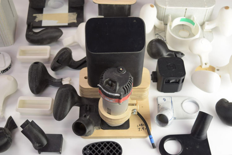
To help us hone in on design decisions, we turned once again to physical prototyping. The best way to test any new design is to build it and try it out, especially when refining areas like ergonomics or dust collection.

More Prototyping!

Render of “C” Design
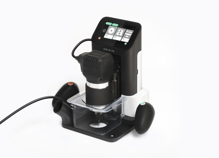
While the design changes to “C” may be subtle at first glance, they result in significant improvements in usability, dust collection, cut accuracy and manufacturability. Below is an image of Shaper Origin our customers will be receiving next year. Thanks for tuning in, and let us know what you’d like to know more about behind the scenes. Let us know (via email, facebook, or twitter) and we’ll do our best to answer them in our next update.

Shaper Origin
Also, we’re hiring!
We have a lot of exciting work in front of us at Shaper, and we’d love your help! We’re currently looking for senior software and hardware engineers to join our team. Check out our careers page, and send us a note if you’d like to apply. Thanks, Matty and the rest of the Shaper team.